I was out with my Pater perusing some of the second-hand bookshops along the Charing Cross Road when he pointed out a copy of the 1969 edition of The Man From U.N.C.L.E. Annual, in a dank subterranean basement, for just two quid. This seemed remarkably cheap for the Charing Cross Road. Closer scrutiny of said item revealed that at some stage the cover of the book had either got wet, or some happy child had attempted to burn it, or perhaps both. But not being the kind of fellow who "slabs" my comic books or won't open up a paperback for fear of cracking the spine, it didn't matter to me. I snapped it up.
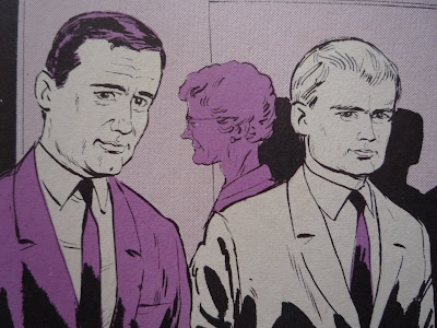
On the cover you can see the stars of the show: U.N.C.L.E. secret agents Napoleon Solo (Robert Vaughan) and Illya Kuryakin (David McCallum), with their boss, Mr Waverly (Leo G. Carroll) peering crustily over the book title. I can almost hear him gruffly mumbling "Open Channel D! Come in, Mr Solo!"

Ironically, I had chosen to focus on the old-school "square" of the programme's duo of leading men - for it was his supposedly Eastern bloc spy-colleague Illya Kuryakin (splendidly played by Brit David McCallum) who was supposed to be the the stylish "swinger" of the show, with his gear Beatles mop-top, groovy black polo-neck jumpers and shades. Anyhow, at the time, I didn't care about that, I wanted a suit like Napoleon Solo's. I still do. But, funnily enough, they don't turn up in the charity shops very often. Incidentally, I do now own a couple of sixties suits (one of which, I'm proud to say, I acquired from a charity shop bargain rail for just a quid. It is known as The One Pound Suit). I wore one to my University graduation in 1993, in fact, with a vintage triangular U.N.C.L.E. badge on the lapel (hidden by my graduation gown), which might give you some idea exactly what kind of a man I am. But, as usual, I digress. What of The Man From U.N.C.L.E. Annual?

 Is it just me, or has the artist copied that car - at that angle - straight from the Zapruder film? If only JFK had had the "beautiful femmes fatales" Stunt Girl Counterspies to protect him. "Good work, Petite...but make sure your shots don't endanger the crowd!" cautions Jet. Useful advice in those tricky firing-your-gun-in-crowded-areas-whilst-riding-a-motorbike situations. Whatta gal.

 Wrong. It's about the Great British Bobby, in the Second World War. What do you think this is, the Man From U.N.C.L.E. Annual or something? Now forget all about those absurd American chappies, and pay attention. You might learn something. See the police officer use his initiative here, wisely arresting anybody with a moustache and a gaunt visage who looks at a signpost in the street. Sentence: death.
 'Ello, 'ello, 'ello. What do we 'ave 'ere, then? The rozzers mop up another Nazi "wearing the disguise of a travelling salesman". Maybe sticking around with that suitcase full of toothbrushes in the immediate vicinity of his 'chute wasn't such a good idea after all. But even spies have to peddle their wares somewhere...
 Enough already with the travelling salesman. What else do we have on file to fill the remaining two panels? Ah yes, a true but non-specific tale of the Scottish coast, in 1940. Don't splash my pencil skirt, you dumpkopf!
 I arrest you for having sopping wet feet on a dry morning. No excuses. And also for wearing 1960s suits in 1940. And, come to think of it, having three legs is suspicious, too. Sentence: death.
 The Kiddies: Please, please, Uncle Peter, can we play THE SELECTA AFFAIR board game?


Uncle Peter: Nearly hit by a car? Why couldn't it be actually hit by a car? God, this is dull.

Sod this, kids. Play by yourselves, now. The pubs are open. [Exeunt.]

Illya? Illya? Is that you? Or a robot? No bananas for me, thank you.

Would you like a sweetie, little girl? Illya??

Illya? You've aged. And yellow's just not your colour.
All of which might give the impression that I didn't enjoy reading the 1969 Man From U.N.C.L.E. Annual. On the contrary, I enjoyed it very much. You will find this annual in THE HOUSE OF COBWEBS. Open Channel D.
I love the Man From U.N.C.L.E. series. Growing up in the 1970s-1980s, I was too young to have seen the TV shows the first time round, but the feature films (which collected together two-part episodes from the original series) were regularly seen on Sunday afternoon telly. It was an excellent tongue-in-cheek spy show made in the shadow of the James Bond movies, and though I was a kid I could immediately detect that it was funnier, more absurd and less self-important, in the same way that Fawcett's Captain Marvel was always more fun than DC's Superman.
Besides this, Napoleon Solo (suavely played by the brilliant Vaughn) was responsible for what became my obsession with what is now known as "retro" clothing (back then it was out of date clobber that you gave to jumble sales). I spent much of the 1970s clad in hand-me-downs from various folks who lived up and down the street (I had a happy childhood, and never went without, but times were tighter back in those days!) - and for a brief time I was unfortunately compelled to wear a particularly awful pair of tartan flares with golden buttons (adorned with anchor designs) down the legs, to emphasise the flare (which, believe me, didn't need emphasising). I was not best pleased. Already yearning for the days when I could choose my own attire, I was awestruck by the sharp style of clean-cut Solo's splendid 1960s suits and narrow ties. He was so cool! But I had no idea then that he was wearing the fashions of a past decade.

Ironically, I had chosen to focus on the old-school "square" of the programme's duo of leading men - for it was his supposedly Eastern bloc spy-colleague Illya Kuryakin (splendidly played by Brit David McCallum) who was supposed to be the the stylish "swinger" of the show, with his gear Beatles mop-top, groovy black polo-neck jumpers and shades. Anyhow, at the time, I didn't care about that, I wanted a suit like Napoleon Solo's. I still do. But, funnily enough, they don't turn up in the charity shops very often. Incidentally, I do now own a couple of sixties suits (one of which, I'm proud to say, I acquired from a charity shop bargain rail for just a quid. It is known as The One Pound Suit). I wore one to my University graduation in 1993, in fact, with a vintage triangular U.N.C.L.E. badge on the lapel (hidden by my graduation gown), which might give you some idea exactly what kind of a man I am. But, as usual, I digress. What of The Man From U.N.C.L.E. Annual?
It's easy to forget, in these fanboy-friendly modern times we live in, that adult devotees of TV shows were not always so well-served in terms of collectible ephemera and spin-off product. Kids' shows were kids' shows. Nobody had a video recorder back then and you were expected to watch a TV show once, half watch the repeat, then forget it. Collectors' DVD box-sets weren't even thought of. Tie-in products - like this annual - were fewer and further between (though U.N.C.L.E. fared better in this regard than many shows of its period, with plenty of magazines and paperbacks) and many such items were generally uninspired, quickly knocked-up cash-ins, designed to be peddled to parents to give to the kiddies on Christmas morning. This annual was meant to be looked at rather than read, scribbled on, made soggy, dried in an airing cupboard perhaps, burnt around the edges, left lying about for a year or two, then thrown away. It was definitely not designed for kooky adults (like our good selves, dear readers) to hoard, wax lyrical about, store in a plastic sleeve, or subject to close analysis. Paradoxically, part of the substantial charm of these hastily-prepared artefacts lies precisely in their weaknesses - the throwaway nature of their production, their unpretentious bargain-basement design, the strange absurdity of their thrown-together content. All these factors help make them fascinating (and highly entertaining, if you are a connoisseur of all things trashy) keepsakes of less pop-culturally aware times, times never to be seen again.
So, what do we have here? All the stuff you always got in these annuals. Reprints of American comic strips - which, as was often the case, were the high point. In this case, these were taken from the Gold Key U.N.C.L.E. comic, which bit the dust in 1969. How can you go wrong with this one, featuring a giant kangaroo, who's also an agent for nefarious spy organisation T.H.R.U.S.H.:

The kangaroo has even developed the villainous scowl of a sinister secret agent. You'll note that the writer and the illustrator have cottoned on to the fact that they can do stuff in a strip that might be a little trickier to stage on TV, and they can do it in lurid day-glo colours, to boot. The strip also features a snake and an eagle, two more mean-looking animal agents for T.H.R.U.S.H. You can't knock the ambition of this tale, even if Napoleon and Illya don't quite look themselves (Solo even seems to have developed a stutter) and the kangaroo looks a bit ratty. I must keep an eye out for some of the Gold Key issues...
A nice surprise was this crazy back-up strip featuring foxy biker chicks...
 Is it just me, or has the artist copied that car - at that angle - straight from the Zapruder film? If only JFK had had the "beautiful femmes fatales" Stunt Girl Counterspies to protect him. "Good work, Petite...but make sure your shots don't endanger the crowd!" cautions Jet. Useful advice in those tricky firing-your-gun-in-crowded-areas-whilst-riding-a-motorbike situations. Whatta gal.
 The problem is, it seems that the publishers of the annual only licensed one comic-book's worth of American strip content. Which meant that the filler-factor was at maximum. As the tightwads who cobbled the book together also didn't cough up for any photos from the programme apart from the ones on the cover, there is an abundant bounty of awful text stories, incredible illustrations of the cast that don't look like the people they ought to look like, and bizarre, unintentionally hilarious filler pages. Imagine getting the gig to write all this stuff. Or to do the illustrations. No-one was ever expected to read it. And no-one cared. It didn't matter in the slightest how it looked, as long as it was done quickly. All of which is highly entertaining in a dreadful sort of way.
The American-ness of the show collides with the British-ness of the cheapo kids' annual on pages like Spy Catchers, which would be more at home in a DC Thompson weekly war comic like The Victor. I include it here for your delectation and delight.

Hmm. The U.N.C.L.E. logo and the title, Spy Catchers. Sounds pretty exciting - I bet it's about the villains that Napoleon and Illya face, right?
 Wrong. It's about the Great British Bobby, in the Second World War. What do you think this is, the Man From U.N.C.L.E. Annual or something? Now forget all about those absurd American chappies, and pay attention. You might learn something. See the police officer use his initiative here, wisely arresting anybody with a moustache and a gaunt visage who looks at a signpost in the street. Sentence: death.
  'Ello, 'ello, 'ello. What do we 'ave 'ere, then? The rozzers mop up another Nazi "wearing the disguise of a travelling salesman". Maybe sticking around with that suitcase full of toothbrushes in the immediate vicinity of his 'chute wasn't such a good idea after all. But even spies have to peddle their wares somewhere...
Ah, himmel! I knew I forgot something! Addendum to next edition of German spies' handbook: after burying parachute, adopting the disguise of a travelling salesman, and stroking chin beneath signpost, remove all German sausage from suitcase. Especially if it's gone green, you might have had it for too long. Sentence: death.
 Enough already with the travelling salesman. What else do we have on file to fill the remaining two panels? Ah yes, a true but non-specific tale of the Scottish coast, in 1940. Don't splash my pencil skirt, you dumpkopf!
  I arrest you for having sopping wet feet on a dry morning. No excuses. And also for wearing 1960s suits in 1940. And, come to think of it, having three legs is suspicious, too. Sentence: death.
There's also a charming but rubbish board game. Imagine the misery of playing this with an actual Uncle on a wet Sunday afternoon...
 The Kiddies: Please, please, Uncle Peter, can we play THE SELECTA AFFAIR board game?
Uncle Peter: Nearly hit by a car? Why couldn't it be actually hit by a car? God, this is dull.

Sod this, kids. Play by yourselves, now. The pubs are open. [Exeunt.]
Splendid stuff. And as for those written stories, well, as you'd expect, knowing my track record, I couldn't get through them, but there are some superbly weird illustrations.


I'm made vaguely uneasy by the vest and Y-fronts combo going on there. I know I shouldn't be, but there's just something about it I don't like. This picture would have given me nightmares as a child. What was going through the artist's mind as he drew this? What was his brief? "Depict unconscious man in background, dressed in vest, white Y-front underpants, socks and shoes."
Look at the strange woman in this next one:


Illya, why are you harassing me with your child-woman blow-up doll? Not that it looks much like Illya, to be honest. It would seem that the main problem the artist faced here, as in all annuals of this kind, was trying to make the illustrations look like the people you'd seen on TV...

Illya? Is that you, Illya? Or a cabbage patch doll? And what happened to my face?

Illya? Illya? Is that you? Or a robot? No bananas for me, thank you.

Would you like a sweetie, little girl? Illya??


Illya? You've aged. And yellow's just not your colour.
All of which might give the impression that I didn't enjoy reading the 1969 Man From U.N.C.L.E. Annual. On the contrary, I enjoyed it very much. You will find this annual in THE HOUSE OF COBWEBS. Open Channel D.